Custom Facing Migration Guide
This document describes how to implement customized facing in nevisIDM.
Customization Possibilities
It is possible to adjust the look of nevisIDM to a customer‘s corporate design by customizing the CSS in regard to the (background) colors, fonts and logos. You can contain the customized CSS and image resources in a specified directory, .jar- or .zip file. When looking up the CSS and image resources, the application always first consults the location with the customized facing.
The basic facing elements are:
css/facing.css– Colors and background colorsimages/nevisIDM_logo.png– The logo in the upper left corner of the header
To customize the path to the facing.css file per client, set the corresponding client property (see Client policy in the nevisIDM reference guide).
Client facing is possible wherever a session context exists (e.g., this is not the case on a logout page).
Customizing Cookbook
The facing mechanism is implemented as a filter that intercepts the loading of resources from the images- and css- directories. Therefore, place the facing resources in a directory called "images" or "css", respectively.
To ensure usability, the CSS definitions of nevisIDM have been split up into two separate files:
css/facing.css and css/app.css.
- The file
css/facing.csscontains the definitions of colors, background colors and other properties that are likely to be subject to change in connection with application facing. - The file
css/app.cssholds the rest of the CSS definitions.
We recommend that you only customize the file facing.css, not the file app.css. If necessary, it is possible to override definitions in the file app.css by adding them to the file facing.css, which is loaded after the file app.css.
To customize the facing, perform the following steps:
- Extract the file
facing.cssfrom the deployed nevisIDM application:- Find
/var/opt/<container>/nevisidm/ -name facing.css
- Find
- Save the file in another location and adapt it as needed (e.g., change colors).
- (optional) Use the developer tools of the web browser to see which definitions affect which elements, for prototyping and to review changes.
- Create a .png file containing your logo and save it as
nevisIDM_logo.png.- (optional) The default logo (182px x 54px) can be changed via CSS.
- (optional) Create a
.jarfile or.zipfile. - Copy your customized facing resources onto the server.
- Set the following attributes in the file
nevisidm-prod.properties:web.gui.facing.location=<path_to_your_facing>web.gui.facing.cache.size=100000
The attribute web.gui.facing.cache.size specifies the maximum size in bytes up to which the system caches a facing entry in the memory. Files larger than that value are read from the disk on every access.
The facing location (web.gui.facing.location) can either be a directory, a .jar file or .zip file. On the top level, the path must contain the "css" and/or "images" directories.
Alternatively, you could specify the facing location when installing nevisIDM. For this, specify the IDM_FACING_LOCATION parameter when you set up the nevisIDM instance:
nevisidm handover IDM_FACING_LOCATION=/my/config/my_idm_facing.jar
nevisIDM 2.60.0.0 Release - Changes
As of release 2.60.0 of nevisIDM, the application pages have a modified header as well as a new footer.
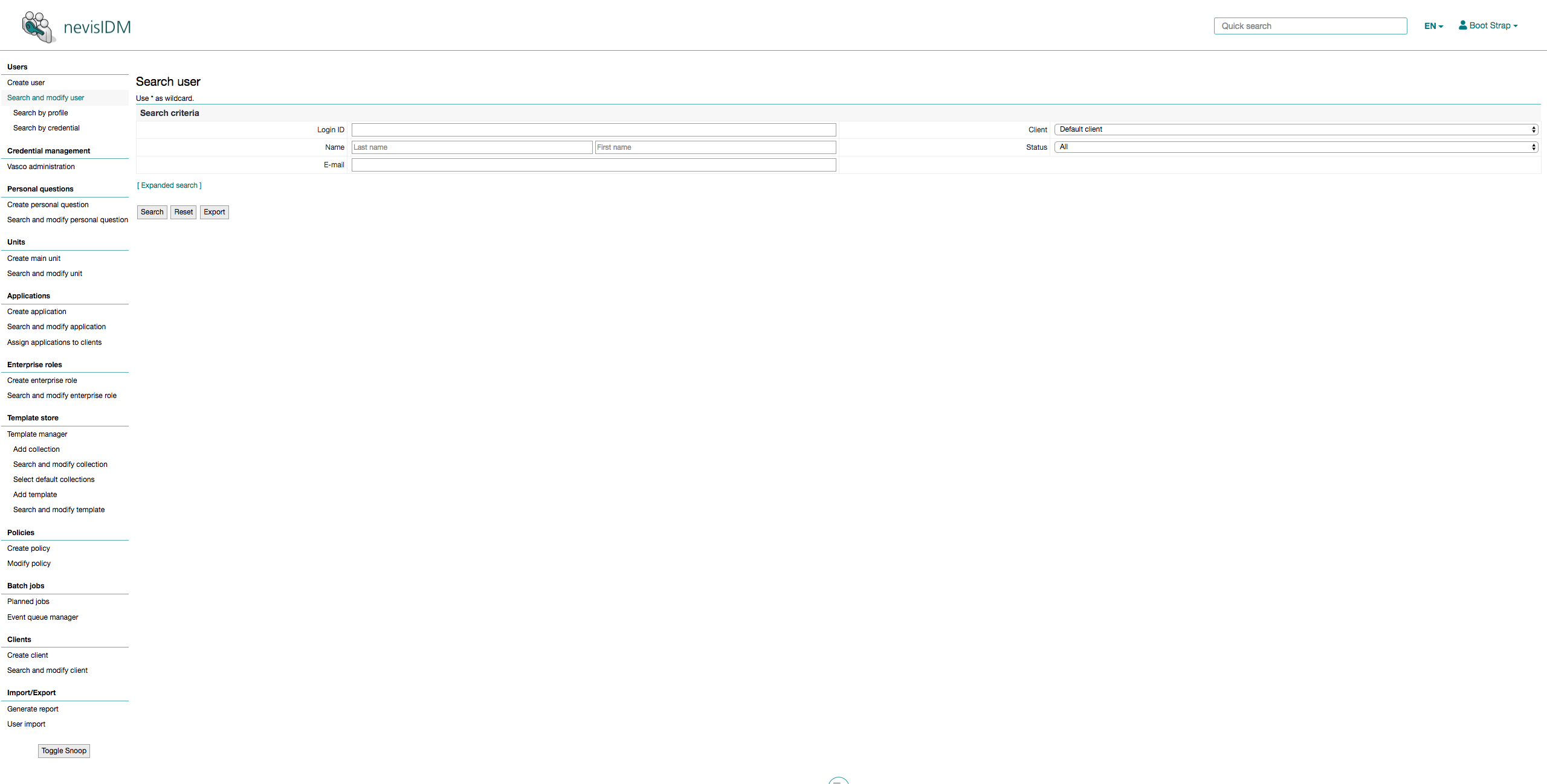
Page overview
This section gives a graphical illustration of the application page.
The figure below shows the application page as of release 2.60.0.0.
General notes
The header and footer are implemented with Bootstrap CSS framework (version 4.1.3). nevisIDM loads the CSS files in the following order:
| # | CSS | Comment |
|---|---|---|
| 1 | Bootstrap CSS | Bootstrap CSS framework. |
| 2 | app.css | Includes the basic nevisIDM styles. Do not override this file. |
| 3 | facing.css | Includes general styles that you can override to customize the branding of the application pages. |
Header
As of release 2.60.0.0, the header exists in two modes: normal and collapsed. When the user scrolls down on the page, the header remains fixed at the top of the screen but collapses, so as not to occupy too much vertical space.
Normal
The figure below shows the new header in the normal mode:

Collapsed
The figure below shows the new header in the collapsed mode:

Collapsing implementation notes:
- When the user scrolls down, a JavaScript function adds the scrolled class to the HTML body tag.
- The collapsing itself is defined with CSS transitions.
- There are CSS styles declared for the header with and without the scrolled class:
.scrolled .navbar-default.navbar-default
In this context, these CSS selectors are relevant:
#header.navbar-default.scrolled .navbar-default
Comparison of the old and the new header
The table below compares the original and new header:
| Elements | Old header (in use prior to release 2.60.0.0) | New header (in use as of release 2.60.0.0) |
|---|---|---|
| Components | + Logo image (of Nevis Security) + nevisIDM product/application title (as text) + User link + Language switcher links + Logout link | + Logo image (includes the nevisIDM product/application title) + User drop-down menu + Quick search text field + Language switcher drop-down menu |
| Logo image | + Represents the Nevis Security logo + Filename: UpperLeftLogo.gif + Type: GIF image + Dimensions: 152px × 31px + Relevant CSS selector: .logo | + Represents the nevisIDM product logo + Filename: nevisIDM_logo.png + Type: PNG image + Dimensions: -Original size: 364px × 108px -Displayed size: 182px x 54px -Collapsed size: 44px x 30px + Relevant CSS selectors: .site-logo .scrolled.site-logo Note that the new header does not have a place holder for the name of the product/application. If you want to show the product title in the header, the logo image should include the product title. |
| Product/application title | + Contains a text placeholder for the product/application title + Content (from the nevisIDM internal translation file): -German: nevisIDM - Benutzerverwaltung -English: nevisIDM - User Administration -French: nevisIDM - Gestion des utilisateurs -Italian: nevisIDM - Gestione utenti + Relevant CSS selector: .titel | |
| Links vs . drop-down menu | The original header uses links: + To display the logged-in user's name/to link to the user's data page. + To switch the screen language. + To log out. | The new header uses drop-down menus: + To display the logged-in user's name/to link to the user's data page and to log out (one drop-down menu). + To switch the screen language. + To display the search result in the Quick search text field. The drop-down menus in the new header are implemented with Bootstrap drop-down. Relevant CSS selectors: .dropdown-toggle .dropdown-menu |
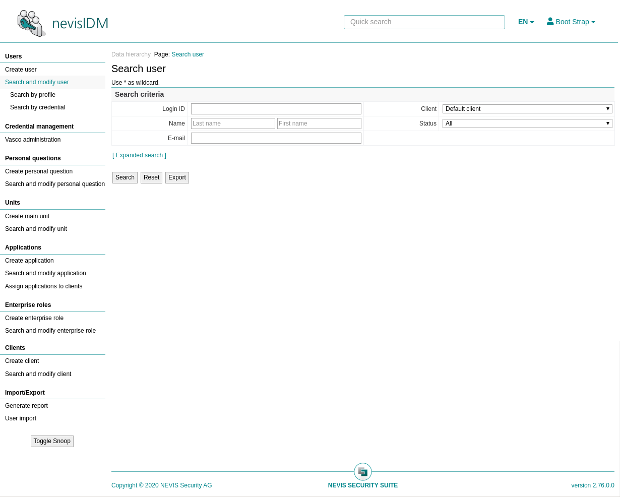
| Display of logged-in user | + By means of a link. + The link displays thelogin ID of the logged-in user. + The link leads to the My user data (self admin) page. + Relevant CSS selector: .user | + By means of a drop-down menu (see the first figure below). + Shows the name (first name, last name) of the logged-in user. + The drop-down menu contains: A link leading to the My user data (self admin) page, and the Logout function. The following list contains the relevant CSS selectors: #user-link: The link that triggers the Logged-in User drop-down menu and shows the name of the logged-in user. #user-dropdown: The drop-down menu itself. #selfadmin-link: The link that points to the My user data (self admin) page. #logout-link The logout link. |
| Logout function | + By means of a link (in the upper right corner of the header). + Relevant CSS selector: .logout | The Logout function is part of the Logged-in User drop-down menu (see above). |
| Selection of the screen language | + By means of links. + Relevant CSS selectors: .LanguageSelector .LanguageSelector ul .LanguageSelector ul li .LanguageSelector a:link | + By means of a drop-down menu (see the second figure below). + Each menu item represents a (link to a) language (see below). + The header shows the language code of the selected language. The following list contains the relevant CSS selectors: #selected-language: The link that triggers the Language drop-down menu and shows the code of the selected language. #language-dropdown: The drop-down menu itself. #language-code/#language-name: Each row in the drop-down menu shows a language code and name. |
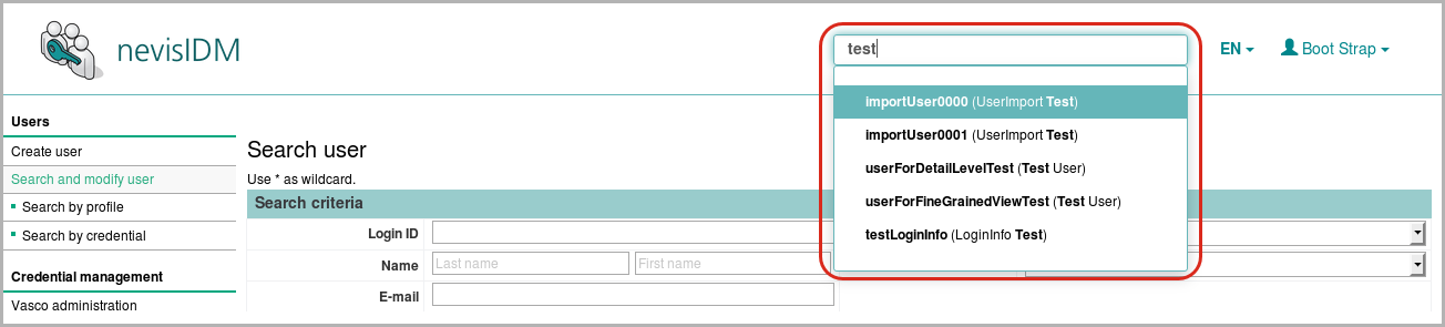
| Quick search text field | By means of the Quick search text field, the user can perform full text searches for supported entities (users, clients, applications, units) - see the figure: nevisIDM Web Application - New header - Quick Search field below.below. Relevant CSS selectors: #quick-search #autocomplete-search The Quick search field is only available if: + The Query Service is enabled. + The logged-in user has the rights to search. The Quick search field is not displayed on the My user data (self admin) page. |
The image below shows the User Data drop-down menu:
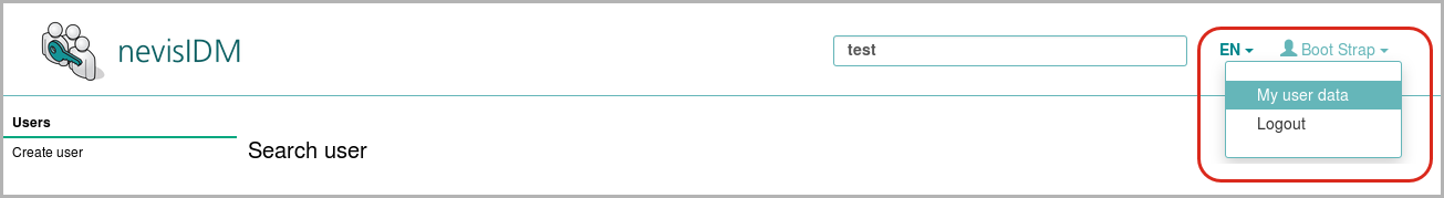
The image below shows the Screen Language Selection drop-down menu:
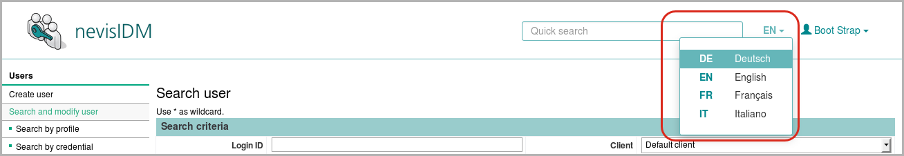
The image below shows the Quick search text field:
The following list summarizes all changes:
- The product/application name appears in the logo image (instead of a stand-alone title in the header).
- The Quick search text field is part of the header (instead of appearing under the header).
- The language selection takes place by means of a drop-down menu (instead of with links).
- Access to the My user data (self admin) page as well as the Logout function happens via a drop-down menu (instead of with links).
- When the user scrolls down, the header will collapse, but remains fixed on top of the page.
The following classes are removed:
titeluserstandortversionlogoutLanguageSelector
The following id-s is removed: menu
Migration
Pay attention to the following aspects when migrating the custom facing.
Logo
To migrate the logo from the original to the new header:
- Save the logo image as a PNG file under the file name: nevisIDM_logo.png.
- Specify the dimensions of the image:
- 182px x 54px (displayed size)
- 44px x 30px (collapsed size)
It is possible to override the image dimensions in the file facing.css. If you do this, adapt the dimensions of the collapsed image accordingly.
- From now on, the logo image must contain the product/application name.
If necessary, override the image dimensions in the file
facing.css. Note that you can now override the styles for the Quick search text field in the filefacing.css.
Footer
New footer
As of nevisIDM release 2.60.0, the application page contains a footer. This footer looks as follows:

The footer includes these components:
- Copyright notice
- Nevis Security Suite logo image
- "Nevis Security Suite" as text
- The nevisIDM product/application version number
The table below lists the relevant CSS selectors:
| CSS selector | Comment |
|---|---|
| .footer | The footer. |
| .footer > img | The round Nevis Security Suite logo image. |
| #product-name | The text "Nevis Security Suite". |
| #copyright | The copyright notice. |
| #version | The nevisIDM product/application version. |
Change summary
In comparison with previous nevisIDM releases and in regard to the bottom of the application page, release 2.60.0 brings the following changes:
- Integration of a new footer (including "Nevis Security Suite" as text, a Nevis Security Suite logo and a copyright notice).
- The nevisIDM version number is now displayed on the bottom right of the application page. The version number is now part of the newly added footer.
Removed classes: version
nevisIDM 2.72.0.0 Release - Changes
Release 2.72 includes an upgrade of Bootstrap, from version 3 to version 4. Customers using custom facing CSS might have to change their customised CSS.
Bootstrap upgrade
- Bootstrap has implemented some class changes: http://upgrade-bootstrap.bootply.com/
- Bootstrap 4 dropped all the glyphicons. We integrated Font Awesome icons to replace the old glyphicons: http://fontawesome.com/icons
Screenshot
The following image shows the new layout. Except for the icons and some margins, nothing has changed.
Source code change
With the upgrade, the layout of the header has slightly changed. This section points out the most important changes to help customers to adapt their custom facing CSS to our new UI.
Header diff
--- nevisidm-jspapp-web/src/main/webapp/doc-root/HeaderTile.jsp (revision a9de0972e7184fc32a30e25094c04e78d1dc6518)
+++ nevisidm-jspapp-web/src/main/webapp/doc-root/HeaderTile.jsp (revision 0c6ae936a8c596eafc6c7a53ebca128a76ede4d2)
@@ -6,21 +6,21 @@
<%@ include file="includeTLDs.jsp" %>
-<
+<
<
<!-- Brand and toggle get grouped for better mobile display -->
- <
- <button type="button" class="navbar-toggle collapsed" data-toggle="collapse" data-target="#header-navbar-collapse" aria-expanded="false">
- <span class="sr-only">Toggle navigation</span>
- <span class="icon-bar"></span>
- <span class="icon-bar"></span>
- <span class="icon-bar"></span>
- </button>
+ <
<a class="navbar-brand site-logo" href="#"></a>
</
<
<!-- Menu links -->
- <ul class="nav navbar-nav navbar-right">
+ <ul class="nav flex-row ml-auto" style="margin-right: 5px;">
+
+ <!-- Quick Search field -->
+ <%-- NOTE: This should be *after* all the nav links to be displayed properly! --%>
+ <form id="quick-search" class="navbar-form ml-auto" role="search">
+ <nevisidm:autocomplete-search/>
+ </form>
<!-- Help button -->
<c:set var="locale"
@@ -28,30 +28,30 @@
<c:set var="helplink">
<utils:helpLink locale="${locale}"></utils:helpLink>
</c:set>
- <li><c:if test="${not empty helplink}">
+ <li class="nav-item"><c:if test="${not empty helplink}">
<a href="<c:out value='${helplink}'/>"> <i
- class="glyphicon glyphicon-question-sign" aria-hidden="true"></i>
+ class="fas fa-question-circle" aria-hidden="true"></i>
</a>
</c:if></li>
<!-- Language dropdown -->
- <li class="dropdown" id="language-dropdown">
+ <li class="dropdown" id="language-dropdown" style="margin-right: 1.5px;">
<tiles:insert page="includeLanguageSelector.jsp" />
</li>
<!-- "User" dropdown -->
<li class="dropdown" id="user-dropdown">
<a href="#" id="user-link" class="dropdown-toggle" data-toggle="dropdown" role="button" aria-haspopup="true" aria-expanded="false">
<%-- The caret and the icon should be on this same line as the user name! Otherwise there will be a space between them! --%>
- <i class="glyphicon glyphicon-user" aria-hidden="true"></i><span><c:out value="${sessionScope.firstName}"/> <c:out value="${sessionScope.lastName}"/></span><span class="caret"></span>
+ <i class="fas fa-user" aria-hidden="true"></i><span><c:out value="${sessionScope.firstName}"/> <c:out value="${sessionScope.lastName}"/></span><span class="caret"></span>
</a>
<ul class="dropdown-menu">
- <li>
+ <li class="dropdown-item">
<!-- My user data -->
<a id="selfadmin-link" href="/nevisidm/selfadmin">
<bean:message key="form.navigation.level2.userModifySelf"/>
</a>
</li>
- <li>
+ <li class="dropdown-item">
<!-- Logout -->
<html:link styleId="logout-link" page="${applicationScope.logoutUri}">
<bean:message key="form.logout"/>
@@ -61,13 +61,6 @@
</li>
</ul>
-
- <!-- Quick Search field -->
- <%-- NOTE: This should be *after* all the nav links to be displayed properly! --%>
- <form id="quick-search" class="navbar-form navbar-right" role="search">
- <nevisidm:autocomplete-search/>
- </form>
-
</
</
</
Facing.css diff
--- nevisidm-jspapp-web/src/main/webapp/doc-root/css/facing.css (revision 20ffded27a18cac8c247bf43a3ab2da3f04377f2)
+++ nevisidm-jspapp-web/src/main/webapp/doc-root/css/facing.css (revision 0c6ae936a8c596eafc6c7a53ebca128a76ede4d2)
@@ -345,27 +345,48 @@
  font-size: 14px;
 }
-/* Change the menu item color on hover */
-.navbar-default .navbar-nav>li>a:hover {
- color: #65b6b9;
-}
-
 /* Header dropdown menu general styles */
-.navbar-nav>li>.dropdown-menu {
+.nav>li>.dropdown-menu {
  border: 1px solid #65b6b9;
  border-radius: 3px;
  padding: 17px 0;
+ margin-top: -5px;
+ right: 0;
+ left: auto;
+ -webkit-box-shadow: 0 6px 12px rgba(0,0,0,.175);
+ box-shadow: 0 6px 12px rgba(0,0,0,.175);
+ line-height: 20px;
+ font-size: 14px;
+}
+
+.dropdown-toggle::after {
+ vertical-align: middle;
+ margin-left: 0;
 }
-.dropdown-menu>li>a:hover {
- background-color: #65b6b9;
- color: #fff;
+.dropdown-item>a {
+ display: block;
 }
-.navbar-default .navbar-nav>.open>a, .navbar-default .navbar-nav>.open>a:focus,
- .navbar-default .navbar-nav>.open>a:hover {
+.navbar-default .navbar-nav>li>a:hover,
+.dropdown>a:hover,
+.dropdown.show>a,
+a>.fa-question-circle:hover {
  color: #65b6b9;
- background-color: transparent;
+ text-decoration: none;
+}
+
+.dropdown-item {
+ padding: 0;
+ color: #212529;
+ display: block;
+}
+
+.navbar-default .dropdown-menu li>a:focus,
+.navbar-default .dropdown-menu li>a:hover {
+ background-color: #65b6b9;
+ color: white;
+ text-decoration: none;
 }
 /* Language dropdown */
@@ -522,6 +543,12 @@
  border: 1px solid #f0f1f3;
  background-color: #ffffff;
  font-weight: bold;
+ white-space: nowrap;
+}
+
+#historyDiffRecordTable td.frmInput,
+#historyDiffRecordTable td.frmInputIcon,
+#historyDiffRecordTable td.frmInputStatus {
  white-space: normal;
 }
nevisIDM 2.75.0.0 Release - Changes
In case of a standalone deployment, the location of the resources must be in the instance folder of nevisIDM, for example create a facing folder in the conf folder. The location of web.gui.facing.location must be relative to the instance folder and can be specified in the nevisidm-prod.properties configuration file like the following:
web.gui.facing.location=conf/facing/
For example, you can create the desired folder structure and then copy over your existing resources to the newly created folders:
create_facing_folders
INSTANCE=<your-instance-name>

mkdir -p /var/opt/nevisidm/$INSTANCE/conf/facing/css
mkdir -p /var/opt/nevisidm/$INSTANCE/conf/facing/images
mkdir -p /var/opt/nevisidm/$INSTANCE/conf/facing/admin/css
mkdir -p /var/opt/nevisidm/$INSTANCE/conf/facing/admin/images
mkdir -p /var/opt/nevisidm/$INSTANCE/conf/facing/selfadmin/css
mkdir -p /var/opt/nevisidm/$INSTANCE/conf/facing/selfadmin/images
mkdir -p /var/opt/nevisidm/$INSTANCE/conf/facing/certupload/css
mkdir -p /var/opt/nevisidm/$INSTANCE/conf/facing/certupload/images
# copy your existing resources to the newly created folders